Your app icon is the first thing people see in the Play Store, the App Store and on their home screen, next to dozens of other apps. It has to be bold, simple and correct for each store. This guide shows how to design one for free and export the exact files Android and iPhone need.
What makes a good app icon
- One symbol. A single icon or one or two letters. No words except a very short name.
- A full, colorful background. Gradients and bright colors stand out on a home screen.
- Centered with room around it. Phones crop icons into circles and other shapes, so the edges may be cut off.
- No screenshots or photos. They turn into noise at 48 pixels.
Step 1: Choose an app icon design
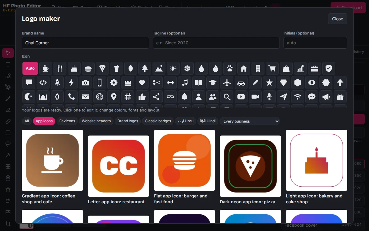
Open the logo maker in HF Photo Editor, type your app or brand name and click App icons. Each design is a 1024 × 1024 square: gradient, flat, dark neon, bubble, letter and badge styles. Pick an icon in the Icon row to use a symbol that matches your app, such as a chat bubble, cart or rocket.
Use Every business to see icons made for your type of app. If your brand does not have a logo yet, our logo maker guide walks through the whole process.
Step 2: Make the icon a full square for the stores
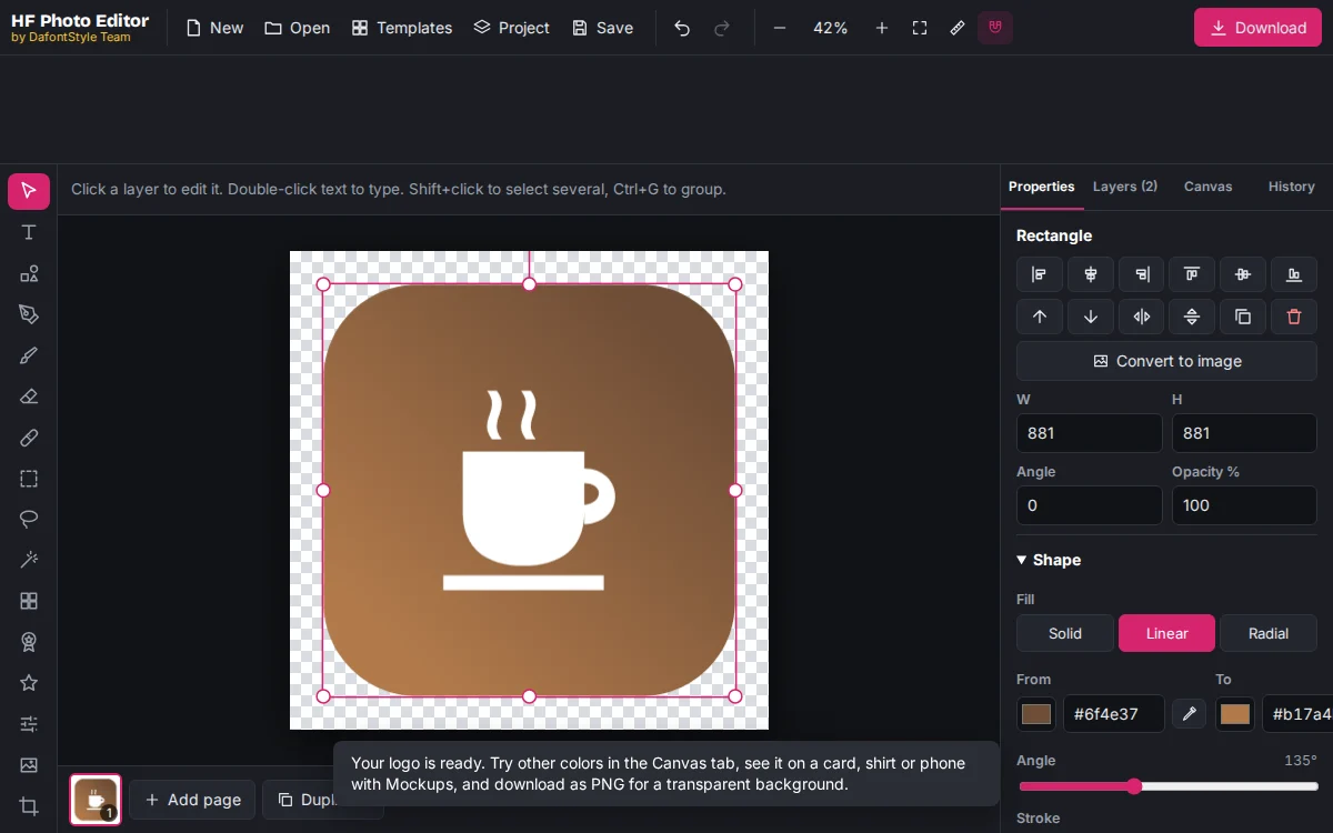
The designs show rounded corners so you can judge how the icon looks on a phone. The stores add the rounding themselves, so the file you upload must be a full square.
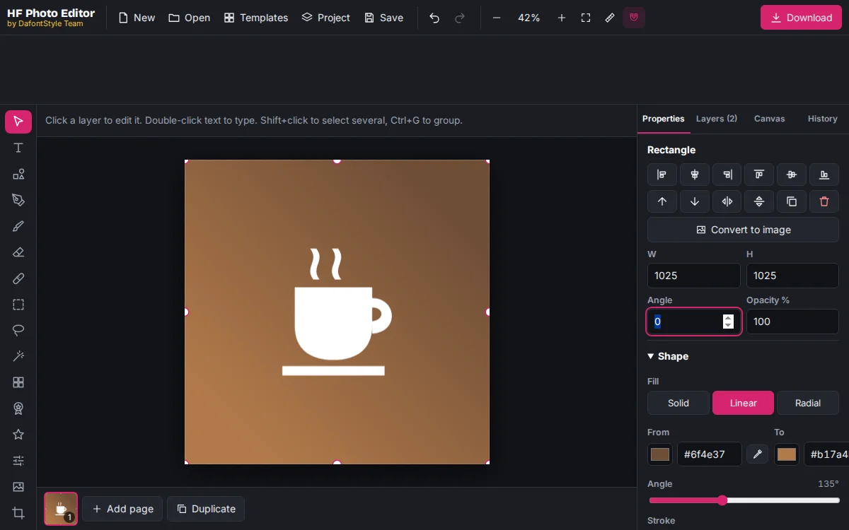
- Click the colored background shape to select it.
- In Properties, set Corner radius to 0.
- Type 1024 in W and in H. The shape now fills the whole canvas.
Step 3: Keep the icon inside the safe zone
Android phones from different makers crop icons into circles, squircles and rounded squares. iPhones round the corners. Anything near the edge can be cut off.
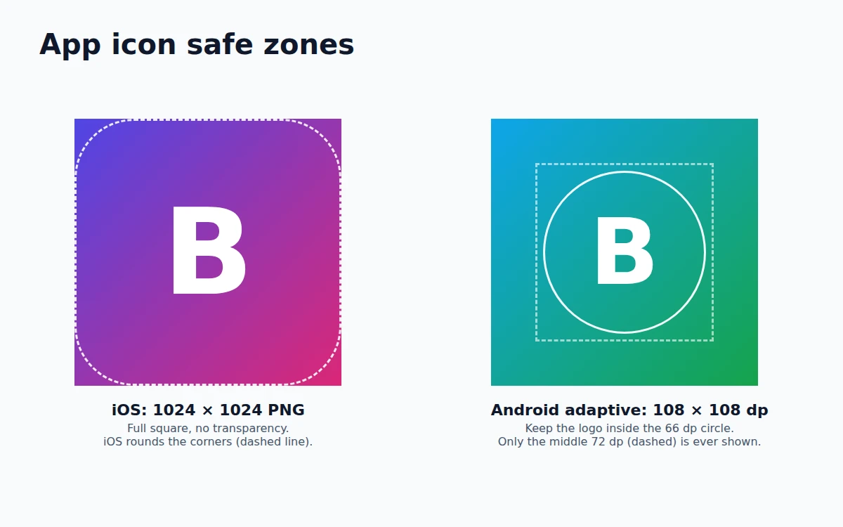
On a 1024 × 1024 canvas, keep the symbol inside a centered circle about 620 pixels wide. That matches the 66 dp safe zone of an Android adaptive icon (108 dp in total). The designs in the logo maker already follow this rule; if you enlarge the icon, check the edges again.
Step 4: Export the files
Click Download and choose PNG:
| Store or use | Size option | File you get |
|---|---|---|
| iPhone App Store and Xcode | 1× | 1024 × 1024 PNG |
| Google Play store listing | 0.5× | 512 × 512 PNG (keep it under 1 MB) |
| Android Studio launcher icon | 1× | 1024 × 1024 PNG, made into all sizes by Android Studio |
For the exact size of every other icon, from favicons to profile pictures, see the full list of logo sizes.
Step 5: Add the icon to your app
Android (APK or app bundle)
In Android Studio, right-click the res folder and choose New → Image Asset. Pick Launcher Icons (Adaptive and Legacy) and:
- For the Foreground layer, use a PNG of only the symbol on a transparent background. In the editor, delete the background shape and download again; the canvas is already transparent.
- For the Background layer, enter your background color.
- Use the Resize slider until the symbol sits inside the safe-zone circle in the preview.
Android Studio then creates every launcher icon size for you. Upload the separate 512 × 512 PNG in the Google Play Console, in your app's Main store listing under App icon.
iPhone and iPad
In Xcode, open Assets and select AppIcon. Set it to Single Size in the Attributes inspector and drop the 1024 × 1024 PNG into the slot; Xcode makes the smaller sizes.
The App Store rejects icons that are transparent or have an alpha channel, even when every pixel is solid. If Xcode or App Store Connect complains:
- Make sure the background fills the whole square (Step 2).
- Download the icon as JPG at 1×, which never has transparency.
- On a Mac, open it in Preview, choose File → Export, pick PNG and untick Alpha.
Flutter, React Native and web apps
Most app frameworks have a launcher icon tool that starts from one 1024 × 1024 image. For an installable web app (PWA), export 192 × 192 and 512 × 512 PNGs, and give the browser a favicon for your website from the same design so the brand looks the same everywhere.
Common mistakes
- Rounded corners in the file. The stores round the corners again, leaving a thin edge or a dark ring.
- Text that is too small. An app name inside the icon is unreadable on a home screen. Keep the name for the store listing.
- Transparent iPhone icons. They are rejected. Android launcher foregrounds are the only place where transparency belongs.
- Different icons in different places. Use the same symbol and colors in the store, on the website and on social media, so people recognize your app.